
How to Design a Poster That Actually Grabs Attention
- August 30, 2026
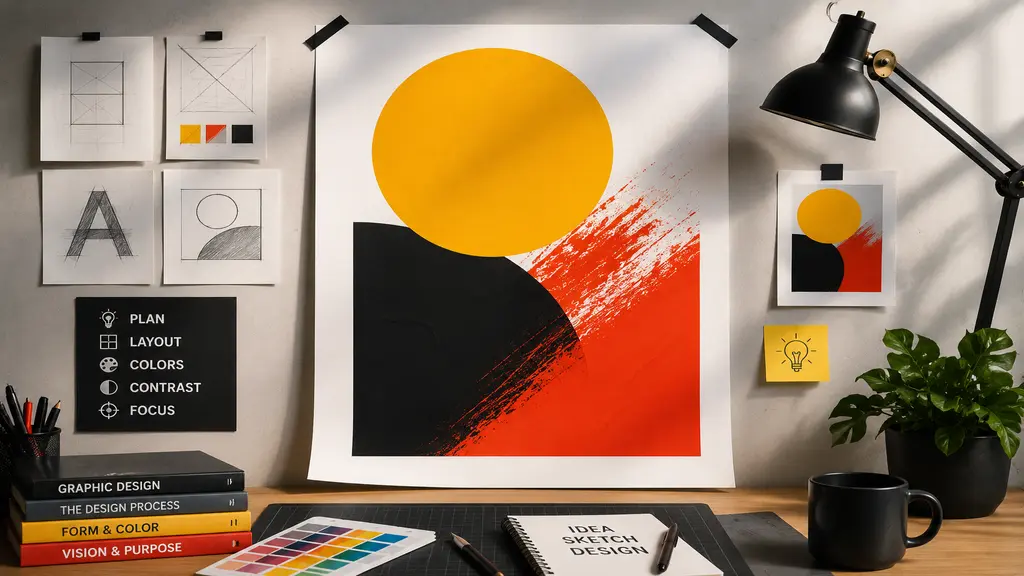
Two posters, same wall, same week. One gets a glance and nothing more. The other stops people mid-step. What’s the actual difference? Usually not talent. Most people making posters that work aren’t trained designers. They just made a handful of good calls along the way, and skipped a handful of bad habits everyone else falls into. That’s really what how to design a poster comes down to. Not magic. Not expensive software. A few decisions, made on purpose instead of by accident. This piece walks through those decisions one at a time, so the next poster you put together is the one people notice first.
What Is Poster Design?
Simple way to put it: poster design is text, images, and color, arranged on one page, built to say something fast. Not in a paragraph. In a glance. A brochure can afford someone’s full attention for a minute or two. A poster gets maybe three seconds before that person’s already moved on, in real life or on a screen. So every piece on the page has to justify itself. Headline, photo, even the empty space around them. If something isn’t pulling its weight, it’s just clutter sitting there.
Set Your Poster Goal
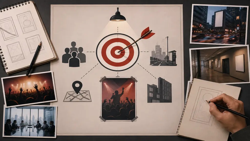
Before touching any design tool, stop and ask a plain question. What is this poster actually for. Selling something, getting people to a place, or just putting a name out there. Pick one job for it. Trying to do two or three at once is usually why a poster ends up doing none of them properly.
- The one line people should still remember later, after they’ve looked away. That’s your message, and it has to be obvious, not buried in a sentence somewhere.
- Who’s actually looking at this. A festival crowd wants something loud. A boardroom wants something restrained. Same message, different poster.
- Where does it go up. A busy street needs big, blunt text. A quiet hallway lets you get away with more detail because people stand closer.
This is the step almost everyone rushes past. It shows. Skip it and the poster tries saying five things at once, which in practice means it says nothing clearly.
Choose a Poster Layout
Layout decides what someone sees first, and where their eyes go after that. Get this part wrong and even strong content gets lost in the noise.
- Rule of thirds helps more than it sounds like it would. Split the page into a 3×3 grid and line up the important stuff along those lines instead of dead center. It just reads more natural.
- Set a clear size hierarchy. Headline biggest, subheading a notch smaller, body text smallest of all. Same size everywhere and nothing actually stands out.
- Leave room to breathe. A packed layout feels cluttered even when every single piece on it is well made on its own.
A good layout works almost like a path for the eye to follow. Headline first, image next, details after that. Force someone to hunt for information and most of them just stop looking.
Pick the Right Colors
Color registers before anyone reads a word. First impression, no exceptions, so this isn’t the place to guess.
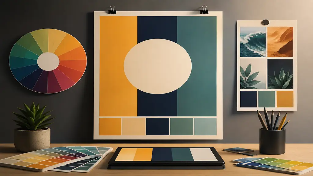
- Keep it to two or three main colors. Add more and they start pulling against each other instead of working together.
- Contrast does more work than people realize. Dark text on a light background, or flipped, is simply easier to read from a distance.
- Colors carry a mood whether that’s intentional or not. Bright and warm feels energetic. Muted and cool feels calmer, more serious. Match it to what the poster’s actually about.
Adobe Color and Coolors are fine places to start if you want something that looks planned. Or just look at what’s already working around your industry. Colors that keep repeating aren’t there by accident.
Choose Easy-to-Read Fonts
Fonts get underestimated constantly. A poster can look beautiful and still fail completely if nobody can actually read the text on it.
- Two fonts, at most. One for headlines, one for body copy. Push past that and the whole thing starts looking like a ransom note.
- Fancy script belongs in a headline, a short one. Never a paragraph. Nobody wants to decode cursive walking past a bus stop.
- Shrink it down or print it, then step back a few feet. Still readable from there? Good. If not, back to the drawing board.
Canva and Google Fonts already have pairings tested a thousand times over. No real reason to reinvent that from scratch.
Use Quality Images
Images land differently than text. Faster, more emotional. A blurry or badly cropped photo drags the whole poster down no matter how sharp everything else is.
- High resolution, always. Low quality images stretch and go grainy the moment they’re printed at any real size.
- Clean backgrounds matter more than people give them credit for. A messy one steals attention from whatever the poster’s supposed to be about.
- Subject stays front and center. Text and graphics should back it up, not fight it for attention.
This is exactly where solid photo editing quietly earns its place. Background removal, clipping path work, retouching. Small technical fixes that turn an average product shot or event photo into something that genuinely looks poster ready, subject clean and sharp against everything else on the page. If your poster leans on a product image or a portrait that needs a proper cutout, having that photo edited first changes the final result more than most people expect going in.
Best Poster Design Tools
None of this needs expensive software. A short list of tools covers most of what a beginner will actually need.
- Canva. Drag and drop, huge template library, zero design background required.
- Adobe Express or Photoshop. More control if custom is what you’re after.
- Figma. Free, and it works well when more than one person’s designing together.
Grab a template close to what’s already in your head and build from there. Colors, fonts, images, adjusted to fit. Starting from a totally blank canvas takes longer, and most of the time it just isn’t worth it.
Common Poster Mistakes
Even with the right tools sitting right there, a few habits keep quietly ruining otherwise decent posters.
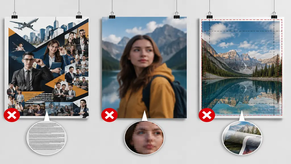
- Too much text. If someone can’t get the point in five seconds, trim it down. No real way around this one, unfortunately.
- Low resolution images stretched way too big. It happens all the time and it’s an easy thing to catch beforehand.
- Ignoring the actual print size. Something flawless on a laptop screen can look completely off once printed full scale, so double check dimensions and bleed before calling it finished.
Conclusion
At the end of the day, how to design a poster really comes down to a short list, not some hidden trick. One clear goal. Simple layout. Colors and fonts that actually work with each other. Images that don’t cut corners. None of that needs formal training behind it. It just takes a bit of patience, and honestly, the discipline to cut things rather than pile more on. Get these basics down and posters stop getting scrolled past. They start getting noticed instead.
