
How to Adjust Size of Picture in HTML: A Simple Guide for Beginners
- Mark Mendoza
- September 7, 2026
- Tags: HTML images, HTML tutorial, image size HTML, resize picture, web design
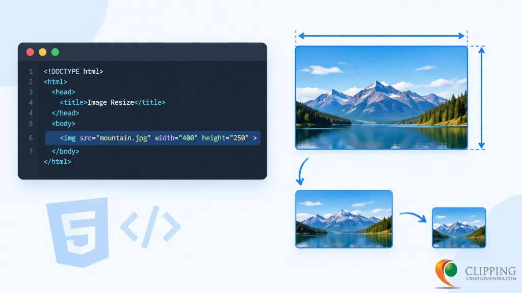
If you make a website and your images become big or small size, then I think you are searching for how to resize image in HTML. A really common technical problem new web builders struggle with. A heavy image will slow your page down, and a very small image can make your website look unbalanced or unprofessional. As luck would have it, find the proper method to resize a picture in HTML is quite straightforward.
In this tutorial, you will understand how to resize an image in HTML, why is it important and how to do so properly so your web page looks neat on any screen. You also will find real life examples so you can copy-paste and use in minutes.
How to Adjust Size of Picture in HTML Using Width and Height
The simplest way to change a picture’s size is by adding the width and height attributes directly inside the img tag. Here is a basic example:
<img src=”flower.jpg” alt=”A red flower” width=”400″ height=”300″>
In this example, the picture will show at 400 pixels wide and 300 pixels tall, no matter what its original size was. This method is quick and works well for simple pages.
How to Resize Pictures Using CSS
While the HTML method is easy, most of the professional developers prefer to use CSS to control picture size. When you use the CSS method, this gives you more control and works better across different devices. Here is how you can do it:
<style>
.my-photo {
width: 100%;
max-width: 500px;
height: auto;
}
</style>
<img src=”mountain.jpg” alt=”Mountain view” class=”my-photo”>
In this image resizing process, the picture will not be wider than 500 pixels, but it can be a little shrunk on any other smaller screens. The height: auto part is important because it keeps the picture’s shape correct while the width changes.
How to Make Pictures Look Good on Every Screen Size
Today, people visit websites from phones, tablets, laptops, and desktop screens. A picture that looks perfect on a computer might look too big or cut off on a phone. This is called making a picture “responsive.”
To make your pictures responsive, use this simple CSS rule:
<style>
img {
max-width: 100%;
height: auto;
}
</style>
This tells every picture on your site to never go wider than its container, but it can shrink down freely as the screen size gets smaller. This is one of the easiest and most useful tricks in web design, and almost every modern website uses it.
Conclusion
A small skill that has a big impact on your website how it looks and performs, is learning how to change image size in HTML. Whether you are opting for the straightforward width and height attributes or a more flexible CSS approach, your common goal is to achieve images that fit well, load fast, and look good on any device. Try the examples above yourself on your very own page and you will immediately get a more professional look to your website.
FAQ's
The easiest way is to add width and height attributes directly in the img tag, like width=”400″ height=”300″. This works well for quick, simple pages.
No. Resizing with HTML or CSS only changes how the picture looks on the screen. The actual file size stays the same, so it is still smart to compress large images before uploading them.
Keep the same ratio between width and height as the original picture, or simply use height: auto in CSS so the picture keeps its natural shape while the width adjusts.